Posts

Showing posts from February, 2022

Script

Image
The Odd Man Out  Scene 1: A prisoner is on his knees, he is seen picking away at a large stone with a pickaxe     Over the shoulder shot (right shoulder) as he works     Prisoner- (V.O.) My name is Robert Spence. I'm 29 years old. I'm innocent. I'm the only innocent man at the Federal Prison Camp, in "beautiful" Pensacola Florida. Somehow, I still manage to get treated worse than the murderers, the kidnappers, the . It's like I'm the odd man out. He stops working before we Zoom in on Robert's head and suddenly there is color. We see him dressed sharply coming up the stairs before he steps into his living room Scene 2:     Robert- Sage, I'm home! A woman gets off the couch and runs to greet him, his wife      Sage- How was work today, hun?  She kisses him on the cheek, then they sit together     Robert-  You know, it was Strange. We had a lot of police and federal agents in and out of the office and they interviewed everyone. It put everyone on edge

Title Design in Detail

Image
  Font- Octin Stencil I plan to use octin stencil for my title cards. I believe that it fits the very militant rule present in most prisons. I also generally like the stencil look. My research on thee font, and finding sites for downloading it, most of them say it's perfect for police or military content, and that's what I'm creating. Here is the download link I chose because its free. On its own, the font is bold-faced and in all caps. This amplifies everything I'm aiming to get out. https://fontmeme.com/fonts/octin-stencil-font/ colors- I want the film to be in black and white, so I'd need a color that contrasts it fairly sharply. I'm thinking either a ice white, which would fit in with the grey and black of what's seen on screen, or red. The red would go with the heat of the sun where the prisoner works as well as the harshness of his condition.  Credits- I don't want my credits to be embedded in the scene, as I don't believe it fits in with the c

Escape plan(ning blog)

Image
 Location-  I need a clean-looking office or cubicle, and a residential kitchen. Additionally, I'll need a gravelly area with a large rock, where the prisoner in my movie will be working. I plan to find this using google earth, locating a vacant lot near me. There is one place I can think of, but I don't know how it'll work or how realistic it'll look to the film. There's a spot with a bunch of old railway cement which we can "hack away at", using the prisoner. The attached picture is from google street view and is from a while back, so the concrete slabs aren't there. Costuming- I plan for the prisoner to have two outfits- In flashbacks, we see him sharply dressed in a suit, symbolizing his power in his position. As a prisoner, he will be seen in the iconic prison look, either being an orange jumpsuit or a black and white striped shirt and pants. For the wife, I'd want her dressed in white pants and a colored blouse, regardless of the color. He

Title Design Research prison break- O Brother, Where Art Thou?

Image
 Sourced from Youtube.com O Brother, Where Art Thou? 1. How many titles are displayed during the opening sequences to the film? Which ones? The first title seen shows Universal pictures and touchstone Pictures, followed by Studio Canal. Then, a production company (A working title). Then, what seems to be a hymn or bible verse of sorts, seemingly irrelevant to the movie. Then, it shows footage of the chain gang doing their work, with a few horseback sheriff holding guns. After a while of that, the title card is displayed. Next, it cuts to the three escapees running away before presenting the stars. Soon after, it begins trading off between footage of the men running and introducing other minor actors. After a little over a minute of showing the men and the actors, we begin to see cards for (in order), the supervising sound editor, film editors, music by, costume designer, production designer, director of photography, co-producer, executive producers, produced by, written by, based upon,

Title Research Prison Break- Shawshank Redemption

Image
 Sourced from youtube.com Shawshank Redemption (1994) 1. How many titles are displayed during the opening sequences to the film? Which ones? The first thing we see is the Production Studio (warner Brothers studios) before also showing castle rock Entertainment. We then see the names of the leading players of the movie (Tim Robbins and Morgan Freeman) before then seeing the movie title. As it starts showing footage of the film, the names of various actors in the film pop up in the bottom and center of the screen.  2. What connotations do the images carry? (how do you they make you feel) The images shown make me a little nervous. We first see the outside view of a large home, which gives the feeling that either we the audience are being watched, or we are doing the watching (Through the eyes of a character). It then pans over to a car with a man inside. We can see it is an older car, assumingly 30's or 40's, telling me it is a period piece. We see the man inside from a low angle

Title design research Prison break- Pusher

Image
 Sourced from artofthetitle.com Pusher 1. How many titles are displayed during the opening sequences to the film? Which ones? This title sequence was very different from all others I researched, as it doesn't give much credit to the people who worked on the film. First, it says "Balboa Enterprises PrÆsenterer", before saying "EN HENRIK DANSTRUP/NIKOLAS WINDING REFN PRODUKTION", which is Danish, but I can't figure out the meaning. It then fades in and out, showcasing pictures of the characters and their names in this order: Frank, Vic, Tonny, Milo, and then Radovan. Then, it again says NIKOLAS WINDING REFN before finally showing the title of the movie: Pusher. After that, there are no more titles. It then shows footage of the film with Frank walking through a busy street followed by a handheld camera. 2. What connotations do the images carry? (how do you they make you feel) The images, at least in my mind, kind of looked similar to frontal mugshots, which cou

Title design research prison break- The Great Escape

Image
From Artofthetitle.com The Great Escape  1. How many titles are displayed during the opening sequences to the film? Which ones? The title of the movie itself is only shown once after listing off the three stars of the movie. After that, in order, it follows: Co-starring, With (highlights smaller actors in the film), Music (The composer Elmer Bernstein, the Director of Photography, then one still with the art director, film editor, assistant to producer, and highlighting it was filmed in Panavision. Following that, is a little footage which then displays the Production supervisor, assistant director, script supervisor, music editor, sound effects editor, set decorator, then mentioning Property, makeup, special effects, wardrobe, assistant film director, casting, color by, who the screenplay was by, who wrote the book, then finally the producer and director. Lastly, there is a message explaining that the movie is a true story. 2. What connotations do the images carry? (how do you they ma

Title Website Research

Image
 In order to design my title sequence for my show, I needed to first understand how a title sequence should look. I did some digging, and I found two websites. Today, I will be discussing these websites with you. The first was Artofthetitle. The homepage contained a handful of options for different opening sequences to view, with some being in playlists. One that stood out to me, due to its recent relevancy, was they had a standalone button to press to see the Queen's Gambit opening sequence. At the top were two buttons: title sequences and Designers+studios. When you clicked on title sequences, it drops down a page similar to the homepage, with many of the same options plus a few extra options of other title sequences. The next button over was Designers+studios. When clicked, it released a dropdown, which displayed the names of (I'd guess) over 250 creators, from A to Z, and again, guessing well over 100 studios. This was an impressive website, and it had a lot to offer. The n

"The Great Escape" and its conventions

Image
 Being that it was shot in 1963, the quality of this film is noticeably different than the other two movies we looked at. Those are all considerably newer movies than "The Great Escape". One thing that I kept in mind while looking at this one was that this isn't a prisoner breaking out of a proper prison, rather  prisoner of war breaking out of a Nazi camp. Starting with mis-En-Scene, the costuming in this movie. The costuming was very spot on to the content. The costuming is accurate to the time and place, being a Nazi POW camp. The main supervisor/guard (Von Luger) is dressed properly in a Luftwaffe officer uniform, and the prisoners are all dressed in what they came in wearing. Being that this was a prisoner of war camp, the prisoners weren't robbed of their clothing, hair, or shoes, which the Nazis did in concentration camps. Additionally the set is very realistic. It was modeled after the true place (Stalaag III Prisoner camp), and the specific set is near identi

"Prisoners" and its conventions

Image
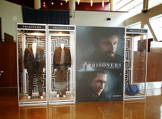
The lighting in the film "Prisoners" feels very natural . For a majority of the movie, the characters are lit by a light placed outside the window, which creates the illusion of daylight or on one side in the indoor shots as if someone were in the room or building. In some scenes, the only light present comes from headlamps, flashlights, and candles. Here, we see high contrast, low light, and deep shadows while still retaining clean visuals.  Prisoners  is a dark film in content, and the director really shows it through the way he did the  lighting. The audience doesn't actually see the sun even once throughout the entire film. Every shot outdoors is done at night, or with gloomy weather, and sometimes in rainy or even snowy times, still obscuring the sun. That results in an a very grey tone with desaturated colors and a visual aesthetic which lines up very well with the story. For the indoor shots, the characters are almost always backlit or side lit, which creates silho

"Shawshank Redemption" and its conventions

Image
The camera angles in Shawshank Redemption serve as  a way of defining a characters and their personalities. The prison warden is often seen from a low angles which accentuates his higher power in the prison and his authority. Doing this effectively shows Norton's (The warden's) place and helps the audience to understand his significance. The prisoners, however are frequently shown from a high angle which has the audience constantly looking down on them. This dynamic presents an imbalance of power, and really does a lot for the character dynamic of the film. A lot of times throughout the movie, we also see the prisoners through a bird's eye view. This is used to make the prisoners look small and insignificant. The director's choices allow the audience to see both the status and imbalance between the characters. It also helps the audience to understand the context of the movie, positioning those where they need to be in order to progress the story. While Andy (the main c

...Drumroll please

Image
 The genre of my opening sequence will be prison break. I came to this conclusion because I simply like what it genre has to offer. Additionally, I like what conventions it has to offer, and it supports one of my pitches. I know that it is doable with what I have at my disposal. Realistically, this was a hard choice, because a lot of the conventions of all three genres seemed very doable. Thriller, comedy, and prison break are all genres I enjoy, on top of that. I picked this above all, because of who I have at my disposal. My idea is to utilize my good buddy Eric for this opening sequence. I already have it all mapped out in my head. From the start, I already had that predisposed lean towards the genre. I know what I want to do in terms of score, which is Uncle Remus by Frank Zappa. If I'm unable to obtain the rights, I plan to hunt for an equally bluesy public domain piece. I plan to heavily rely on the cutaway editing technique, which I was inspired by the Shawshank Redemption.

A study of thrillers

Image
Common camera angles in your genre- High angled/Birds eye view- These shots are used to give the impression that the focused subject in the frame looks powerless and vulnerable. Close up shots-  focus on the characters reactions and their relation to the events occurring, and how they are feeling at that moment. It is also used to capture detail closely in a scene that is important in the film. Over-the-shoulder shot- builds up tension and suspense, functions in a similar matter as a POV shot Common Mis-en-Scene in your genre- Visible and alterable physical traits like hair, makeup, and clothing are kept rather normal in thrillers, to bring immersion and make it seem real Low lighting is  used a lot to create a mysterious and often suspenseful tone Frequently uses claustrophobic and cramped sets to represent the entrapment the character feels Common Editing in your genre- Parallel editing is used a lot in thrillers, showing the audience what two characters are doing, often at the same

A study of prison shows (That is a genre I think)

Image
Common camera angles in your genre- First person- allows the viewer to see the conditions that the imprisoned are in, builds empathy Over the shoulder shots also serve a similar purpose Birds eye shots allow the audience to see a space in a different light than a frontal shot, or one from the side I've noticed extreme closeups to be very common as well, because they accentuate the facial expression of the characters on-screen Common Mis-en-Scene in your genre- Costume plays a huge part of a prison film, where, in traditional settings, the prisoner is usually wearing clothing that fit like medical scrubs. The prisoners are typically in striped blue or black and white colors, where the cops wear colors like green, brown, or blue Common Editing in your genre- My research on this was rather inconclusive, but using an example (Shawshank Redemption), here's what i've got: Cutaway- the cutaway serves as a flashback to his life before prison, showing the reason why he may be there

A study of Comedy

Image
Comedy Common camera angles in your genre- The Push (Way Too Far) In: When the camera itself moves closer to a character, getting so close it hits them in the face The Pull (Way Too Far) out: The opposite of the way too far in, the camera itself moves very far back, which lets the audience know what's going on, usually provides context. It often goes too far out, which makes it comedic The "wait for it..."- when a camera stays still, often to mount tension or to build comedic effect if/when nothing happens Common Mis-en-Scene in your genre - In a comedy show, the soundtrack is generally more upbeat or bright, as opposed to the sinister tracks that are used more often in more serious television productions.  The costume designs in comedy shows can vary. Although the these shows don't often require some certain shades of colors in order to succeed, some shows use bright and vibrant colors to portray a sense of spontaneity. A great example of this would be the bright Gre

What's up, Pitches?!

Image
 Pitch 1-          A prison break show, we see a prisoner in chains working, flashes to his life before prison, tools one would use to escape. Explanation- I feel as though this pitch is fairly self explanatory. It introduces a character, the prisoner, and frames the show around his struggles. Hopefully, if the Zappa famity trust responds, I will score this to the song "Uncle Remus", off his album "Apostrophe (')". The flashbacks of him back into his old life show him working a nice office job, wearing a nice suit, some returning to his beautiful wife at home. The pseudo-flash forwards show tools one might use to escape- a coil of rope, a pickaxe, potentially some dynamite. Additionally, all moments in the present will be done through inner monologue for this intro. Pitch 2-          A comedy about a middle schooler haunted by the ghost of a high schooler, who helps him get through school, life, and girls. Explanation- Starts off with the middle schooler walking