Title Design in Detail
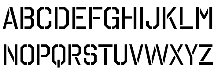
Font- Octin Stencil
I plan to use octin stencil for my title cards. I believe that it fits the very militant rule present in most prisons. I also generally like the stencil look. My research on thee font, and finding sites for downloading it, most of them say it's perfect for police or military content, and that's what I'm creating. Here is the download link I chose because its free. On its own, the font is bold-faced and in all caps. This amplifies everything I'm aiming to get out.
https://fontmeme.com/fonts/octin-stencil-font/
colors-
I want the film to be in black and white, so I'd need a color that contrasts it fairly sharply. I'm thinking either a ice white, which would fit in with the grey and black of what's seen on screen, or red. The red would go with the heat of the sun where the prisoner works as well as the harshness of his condition.
Credits-
I don't want my credits to be embedded in the scene, as I don't believe it fits in with the content. I'd like for them to fade in and out, staying for a couple seconds each.
Title-
I'm not sure what I'd like to title my film. A working title at the moment is "Odd Man Out". This works for me because my main character is truly the only innocent man in the prison, yet he receives the hardest treatment. He is the odd man out.
Studios-
I need names for the studio and the production company. For the sake of ease, I might use aspects of my own name, being my last and middle name respectively. For the production company, I'd like to call it Rosenblum productions. For the studio, I'd like to call it Lane studios.

Comments
Post a Comment